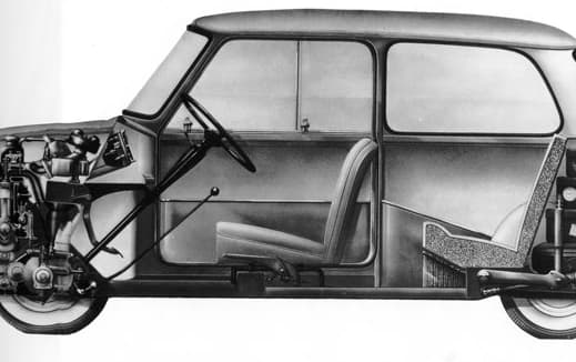
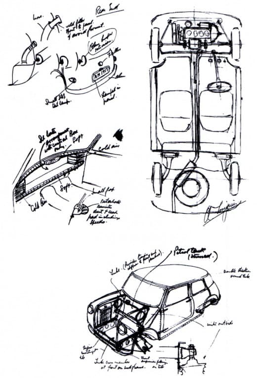
Alec Issigonis designed the first Mini in about 1957 on the back of a napkin. It was such a revolutionary idea, yet so simple and so beautiful. It was easy to communicate with a few pen sketches the intelligence of the thing – a tardis like box that was bigger on the inside than on the outside, where every square inch of space was maximised so that four people could sit in comfort and still have acres of storage space around them.
Issigonis achieved it by mounting the engine, gearbox and radiator sideways, by eliminating anything that wasn’t essential and by getting his old friend Alex Moulton to design tiny rubber suspension pieces instead of springs to stop suspension turrets from jutting into the passenger cell.
It was also, in the early days, just so beautiful – the two spoke Bakelite wheel, the wand like gear stick, those lovely door pulls which where just a piece of plastic coated wire, the sliding windows, those little toggles that were the locks, and the numberplate that flipped down when you opened the boot.
It seemed so obvious to me that architects had such a great deal to learn from his attitude to packaging space, yet remember being told by an old tutor of mine when I was at the AA when I asked her why we thought about space in such a different way to Issigonis: ‘God, you’re so stupid Piers, I cant even believe you’ve asked that question’. But I never understood, because she never told me, why architects couldn’t learn from Issigonis.

