Category - Articles

Letter to Architects’ Journal

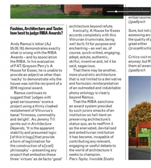
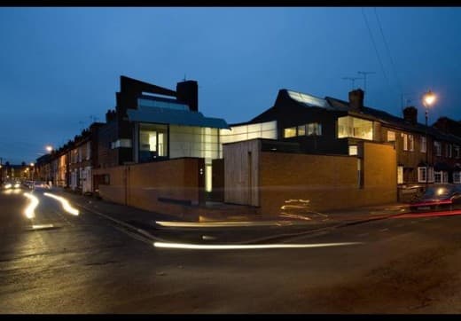
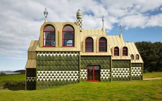
A+House+for+Essex+entranceAndy Ramus’ letter in the Architects’ Journal (06 May 2016) demonstrates exactly what is wrong with the RIBA Awards – and by association the RIBA. In his evaluation of FAT/Grayson Perry’s House for Essex he is unable to provide an adjective other than ‘wacky’ to demonstrate why the house was not the recipient of a 2016 regional award.

Ramus continues to suggest that ‘Judges with great seriousness’ score a project using a thinly cloaked restatement of Vitruvius’ banal ‘Firmness, Commodity and Delight’ . As Jeremy Till points out in Architecture Depends “it is the apparent stability and presumed logic [of this trilogy] that provide a form of legitimation for the construction of a [cod] philosophy’ – presenting any project that that embodies these three ‘virtues’ as defacto ‘good’ architecture beyond refute.

Ironically – A House for Essex accords completely with this Vitruvian triumvirate, being well built, fit for purpose and enchanting – as well, of course as quick-witted, engaging, adept, astute, authentic, skilful, inventive and, let it be said, sagacious.

That there may be another, more pluralistic architecture that is not limited to a derivative and formulaic reinterpretation of an outmoded and indubitable phony ontology is clearly beyond Ramus. That the RIBA sanctions an award system presided by such jurors smacks of an institution so hell bent on preserving architecture’s status quo and reaffirms it as the enervated, devitalised and antediluvian institution it has become, incapable of contributing any relevant, engaging or useful debate to the world of architecture it seeks to champion.

Yours

Piers Taylor

07 May 2016


AJ Awards letter 2016

Categories Articles Tags

Architecture and Ethics

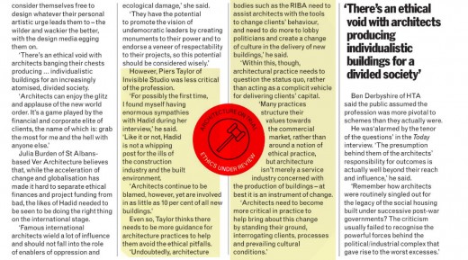
AJ ethicsPiers Taylor’s comments were included in an article on architectural ethics in the Architect’s Journal. Taylor’s edited comments are above – his whole comment is reproduced here:

“There are almost no ethical guidelines provided by the RIBA. The RIBA considers ethics to be serving your client, keeping your mouth shut and not queering your pitch with any concern with wider moral issues. In short, take your clients money, give him what he wants and don’t ask any questions. 

If architects do talk about morality, it is often a phoney morality structured around architectural concerns – as if producing a building that is architecturally inspired and formally well considered absolves them from any deeper engagement with either the motivations of a client, the needs of a user or indeed the needs of their own staff. 

Sadly very few privately funded projects have any ambition beyond the short term view and needs of a client, and many architects see no easy way not to subjugate their own moral positions in fear of losing valuable fee paying work. I’ve been guilty of this too, and I’ve done all sorts of things in architecture that fill me with self loathing. 

Now, my practice generally attempts not take on any privately funded projects and certainly no private houses, as they almost never engage with any wider issues beyond the superficialities of their own physical actuality and their clients vanities. Regardless of Mies’ banal and self serving ‘God in the Details’ meditation, there is never any substance in architectural concerns that are solely material. 

Ideals are typically considered naive by the bulk of the profession, and certainly by the RIBA, who remain utterly toothless, spineless and cringingly corporate. Once, practice was critical as a matter of course. Now, it is usually unthinkingly commercial by design, encouraged as we are by a feeble RIBA to serve clients needs in a simpering and obedient manner.

Practice is hard enough. But architects need more from their professional body than sandcastle competitions and self congratulatory awards. The RIBA has never demonstrated architects value beyond the commercial. Terrified of controversy, it has never fought our corner, and helped champion the role of thinking, feeling practitioners who want to create change.”

Categories Articles, piers taylor Tags

Julian Marsh’s Meat Factory

Indeterminate Space

1249660_marsh_112502_0348Recently, I went to film the Marsh House in Nottingham by Marsh:Grochowski for the next series of ‘The House That £100k Built. The house completely bowled me over – more so than almost any other house I’ve seen. I’d known the house through photographs in journals, but seeing it in the flesh made me realize what a truly remarkable building it is. In almost everything the house does, there is an extraordinarily lesson for domestic architecture.

The house is is Julian Marsh’s  own, and where he lives with his partner artist Jude Liebert, and Jude’s brief to Julian was ‘let’s just have a little flat, with loads of space underneath to make stuff’. Julian calls this space ‘indeterminate space’, and I think it is just about the most important space houses can have. It made me realise just how strangled we are by these terrible little room designations we are so quick to give our houses – the kitchen, the living room, and so on. What we all really need is indeterminate space, which we can use for anything we choose, and occupy differently as needs change, and seasons change. Really good spaces are defined by light, structure, scale, materials and views – not labels purporting to describe (and, usually, limit) function.

The big organizational strategy for the house is to group the living spaces around a south facing growing courtyard with a south facing unheated internal wintergarden cooling the internal spaces in summer and heating them in winter. The wintergarden is a pretty radical thing, as it contains all the circulation space and stairs, meaning that Julian and his partner have to go into an unheated space to get from their bedroom to their kitchen even in the depths of winter.

Having a brilliantly well considered environmental strategy means that the space will never drop below 12 degrees, even in the middle of a harsh winter, but it’s still a pretty radical proposal for living that flies in the face of the culture of sealing up buildings, where having one uniform and stable internal environment is now the norm. As well as every other strategy, the environmental strategy of the house challenges pretty much every building fundamental, and offers hope for those of us who feel strangled in red tape.

Natural ventilation featuers large in Julian’s house. There are clear and defined ventilation paths through the building, with windows, flaps and vent panels that need to be adjusted and operated – a little like sailing a yacht. Julian’s principle of using natural ventilation comes as a big relief for me, in an age where the culture of airtightness is becoming the norm. It is also a relief to see someone challenge basic assumptions, and find a method of using building regulations to support, rather than strangle, his vision.

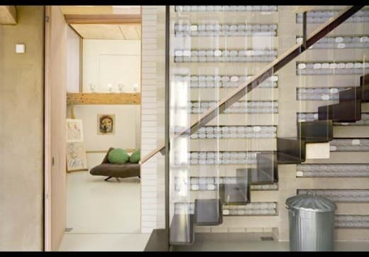
One of the other fascinating things in Julian’s house is how he has used his environmental strategy to define much of the architecture, from the big picture of what the building looks like, how it is laid out, right the way through to the detail. The environmental strategy is visible in the overall form of the building (with it’s greenhouses on the roof, drawing air up through the house), but it is the detail, in particular, that is a real joy. In the wintergarden there is a sublime double height wall which acts as a heat sink – the wall is designed as a series of precast lintel ‘shelves’ with thousands of clear plastic bottles filled with water stacked on them. This is beautiful and decorative, but also highly functional. Water is thermally dense, and consequently all the bottles contribute to the thermal mass of the wall. Simple, low tech, cheap, and beautiful.

It is this kind of resourcefulness that makes the house sing. Freed from the tyranny of having conventional ‘bedrooms’ with his idea of indeterminate space Julian and his partner have a simple thick curtain they pull around the bed at night to keep the light out – and there’s masses of light, as Julian has a penchant for what he calls the ‘sneaked view’ – windows that are sneaked in where you least expect them in order to open up an unexpected view. The sneaked view is such a playful and fun idea, and this spirit of playfulness is everywhere in the house.

1249667_marsh_112502_0219Julian knows the important of the materials that you touch, and consequently has invested time in door reveals, thresholds and simple posts for hand rails that are bound with the most perfect piece of coloured rope at exactly the point your hand falls. This means the remainder of the materials can be functional in the best sense of the word – all the thermally massive precast concrete soffits are exposed, as are the recycled timber ‘Parallam’ beams, and the plastic meat packing curtain balustrades.

The whole house made me wonder why on earth so many of us start with such a misguided idea about ‘rooms’ when we start to design – rather than wrapping an extraordinary series of spaces around an idea of how we might live. There’s a terrible and mean tyranny in estate agent speak that is used to describe houses, and if any of us aspire to beautiful and appropriate spaces that support rather than throttle the way we live, we must go beyond narrow presumptions around domestic space.

We also need to go beyond Building Regulations. So often I hear the excuse ‘Oh, Building Regulations won’t let me’ as an excuse not to try something interesting, but as Julian has shown, there is usually a way round regulations, which are there more for guidance than anything else, and are certainly not design tools. It is this spirit of navigating around obstacles and problems that leads, as Julian has shown, to interesting solutions, and it is this spirit that I encourage self-builders to embrace. Dream up the spaces you most want to live in, and then find a way to use regulations to support, not throttle your vision.

© Piers Taylor, 2015

1249663_marsh_112502_0224

Categories 100k house, Articles, Heroes Tags

No Longer the West Country Underdog

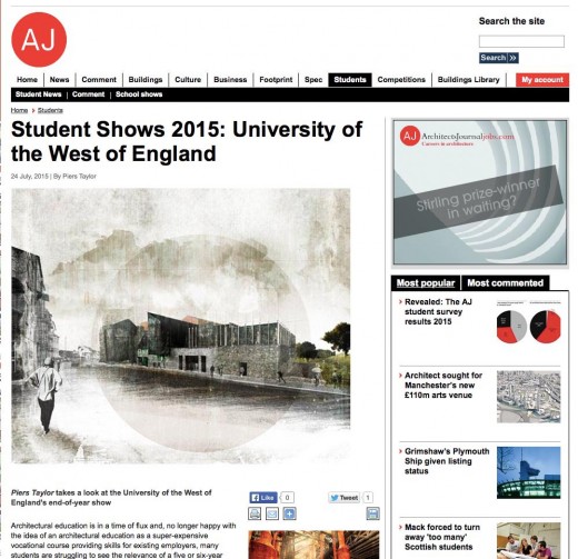
Piers Taylor’s review of the UWE end of year show 2015 for the Architects’ Journal

dbperfumeryArchitectural education is in a time of flux and, no longer happy with the idea of an education as a super-expensive vocational course providing skills for existing employers, many students are struggling to see the relevance of a 5 or 6 year study period that doesn’t ultimately equip them with the skills to be able to come to practice on their own terms.

As a discipline we seem to be in danger of losing our moral compass and sense of purpose as we head for where the money is and subsume any personal ethics beneath those of our clients. Architecture – as any of the arts – needs rethinking by each successive generation of students who ultimately need to be given the critical framework to be able to invent their future.

The default position of many mainstream schools of architecture is simply to teach architecture as the crafting of a static object, presented as a thing of shallow beauty, and perpetuating a way of doing architecture that has been pretty fixed for several generations. It’s kind as if the social issues raised by Modernism or the 1960s never happened, and if ever architectural education needs to change, it is now.

More than anything, architecture schools need to broaden to equip students with the ability of dealing with the mess and chaos of reality with all its glorious dirt and grit. Architectural education needs to change to embrace other and alternative skills needed for architects to act convincingly in the world. This include developing the adroitness for engagement with real and local communities, for tackling environmental issues, for engaging with the concerns of planning policy and, more importantly, engaging with planning at a strategic level. As it happens, this is exactly what UWE are doing.

From an almost standing start and in only a few years, with the extraordinarily energetic Elena Marco at the helm UWE has successfully reinvented itself as a school that is addressing head on the need for architectural education to diversify. UWE’s current courses are unusually wide ranging, and the school adopted early on a joint programme of architecture and planning, and has built on this successfully.

Planning – long seen as architecture’s less glamorous cousin – is now a field in which many architects are realising the real design happens. It is where the big picture is defined, the context is framed and strategies for change created. Planning – rather than merely architecture – is where the future is invented. As Vincent Lacorava has shown in his move from AOC to Croydon Borough Council, planning can be truly exciting and supremely powerful. It is surprising that more universities have not followed UWE’s lead and incorporated planning into the core of the main degree courses. In addition to planning, UWE also have a new dual architecture and environmental engineering degree with RIBA /CIBSE accreditation.

At the end of year show, most of the work I saw was from the final (MArch) year, which is overseen by Rachel Sara (author of Architecture and Transgression). Sara has successfully embedded a stand-alone research module into the core projects, and this translates into a set of student projects that have real depth. Far from focusing on the design of a single building, the diploma projects take on far wider issues, often in places that benefit from architecture the most.

It is a delight to see is students give design its dignity back, and produce work that understand that design can be a tool for delivering vicissitude and innovation, delivered in a grass roots, bottom up way. More than ever, I saw evidence of how design can be a tool for change. It was also a joy to see so many of the students tackle the essential issues of urbanism, reuse and sustainability so convincingly. With projects rooted in these pressing concerns and thorough research one could have almost forgiven the students had they not delivered interesting built proposals, but here too, almost without exception, were a set of buildings that were delightfully eclectic, materially and tectonically rich, and spatially diverse.

UWE is showing how, away from the razzle-dazzle of the big city, from a campus that is a close cousin of a business park, there is a way of doing things differently. Not just differently, but better, as evidenced in work that is rich, quirky, layered, convincing and clever, produced by autonomous and individual students who seem fearless at entering into a static world and creating change. What a long way UWE has come in recent years. Still the West County underdog? I don’t think so.

© Piers Taylor 2015

Image: Dan Badcock – Perfume FactoryAJ UWE 1

Categories Articles Tags

Richard Leplastrier

0d580fa96894c785c76294441d287224I’ve been wondering recently why as a country, we’re all so desperately conservative when it comes to our domestic buildings. I don’t mean in terms of tradition, taste or style – but in the way that the building works.

There’s a typology that has evolved over the last few hundred years that is pretty much the default choice for everybody. This is a house that has basically the same accommodation in it – just configured differently. There’s usually a formal entrance, a living room, kitchen (which, if you’re feeling radical, may be in the same space), a series of bedrooms for individual occupancy, and a bathroom or two.

Bigger houses are generally more of the same, and while there may be many conversations about finishes and fittings, there’s almost no conversation about the principle of a dwelling, and little rethinking of the set of conventional spaces that appear to be beyond question.

Without doubt, the most profound experience I’ve ever had in architecture was going to see a house by the infamous architect Richard Leplastrier in Lovett Bay, just north of Sydney in 2001, and it is a house I think about almost daily.

I’d been in Australia for a few weeks, visiting old friends and looking at a series of supposedly good houses, before I went to see Richard’s house. The other houses that I’d seen just before visiting this one were all award-winning houses – but were all variants on the same theme – just configured differently.

Richard’s place was already special by virtue of the journey needed to get to it – by rowing boat. It was a glorious relief to discover that there was someone that was prepared to go beyond the terrible tyranny of assuming that he needed to be able to park outside his house. Instead, Richard embraced a 15 minute rowing boat ride across the water to the land, which he, his partner and his kids would do every day.

Much as I’m interested in the technology of vehicles, domestic architecture is unquestionably throttled by the dominance and abhorrence of the awful patch of tarmac, which constitutes a driveway and a double garage outside the front door.

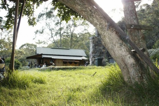
On arrival at Richard’s jetty, there was a short steep walk up through bush land to his house. I call it a house, but the celebrated novelist Peter Carey who wrote a chapter of one of his books about this house called it an ‘extraordinary campsite’. Another architect – Glenn Murcutt – called it ‘like a swiss watch, just an exploded one’.

There was no door to speak of – just a deck that you stepped up on to, and of course no front door – just a series of plywood flaps that opened up on a series of beautifully inventive hinges and struts, through which you could enter – although much of the living was done outside, irrespective of the weather.

There were no rooms to speak of either – just one big open space for all domestic purposes, and from where Richard ran his office. There wasn’t even any furniture to speak of – just one drawing table and Richard’s mother’s old rocking chair in the corner. There was a series of built in window boxes, in which one could sit – but most of the living was done on the threshold out onto the deck, where there were a series of beautifully generous steps, that encouraged sitting and lingering. Not that this was a family that did too much lingering – the kids were all rattling around, without anyone asking them to tidy up or keep quiet. Here was a house that encouraged life – not throttled it like most banal and sanitised contemporary buildings.

The bed, such as it was, was a mattress that the family of 5 would pull down from the exposed ceiling joists at night, and all pile on to. The dunny was across a little plank bridge in the bush, and the kitchen a makeshift affair under the verandah.

Every part of it was acutely beautiful and constructionally brilliant – from an architect who had spent much of his life making timber ‘skiffs’ in which to plough the waters around Sydney. But irrespective of its beauty, the house offered an extraordinary different vision of living, which went way beyond the same series of spaces from which most of us use as a starting point.

Sure, the weather is better in Sydney – but that isn’t the point. You may not want to live like Richard, but that isn’t the point either. The point, of course, is that there is a different model of living from the default and unthinking identikit series of spaces in different dressings which most of us have.

What’s also curious is that Richard’s way of life is that this is how many of us lived up until relatively recently in social history, and was considered the norm. Certainly, up until the middle ages and beyond, families lived in one space, with little privacy. Now, though, despite patterns of work and living having changed dramatically over the last few hundred years, we’re typically unable to reconsider our dwellings from first principles.

This, of course, is a shame – and this means that most of the design conversations around houses in this country are limited to issues of shape, colour and taste, and consequently they’re pretty boring. The conversation needs to move on now, and houses need to change, adapt and evolve. They need to challenge basic assumptions of how we live, and suggest alternatives.

At present, alternative models of domestic space are really only considered by a few progressive architects, and this needs to change and enter the mainstream. More than anything, domestic architecture should be progressive and idealistic, and not default to received norms. The tragedy is that the model of living that is rammed down our neck by mainstream house builders is a cynical one that they know will sell, as there’s little alternative. As a community interested in self-build, we all have an obligation and responsibility to challenge this.

© Piers Taylor, 2015
Categories Articles, Glenn Murcutt, Heroes Tags