Category - Articles

Assemble – Profile by Piers Taylor

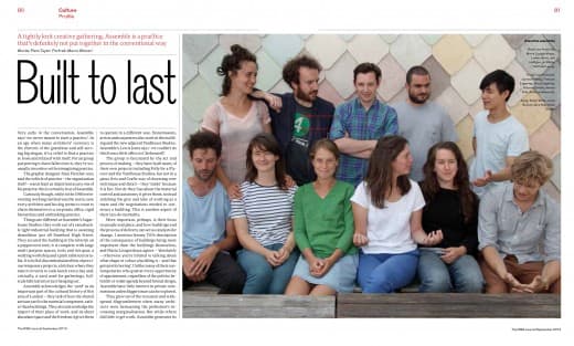
Piers Taylor’s profile piece on Assemble for the September Issue of the RIBA Journal.


Very early in the conversation, Assemble says: ‘we never meant to start a practice’. In an age when many architects’ currency is the rhetoric of the grandiose and self-serving big slogan, it’s a relief to find a practice so loose and relaxed with itself. For an group purporting to have fallen into it, they’re unusually inventive with reimagining practice.

Graphic designer Alan Fletcher of Pentagram once said that the vehicle of practice – the organisation itself – was at least as important as any of his projects; this is certainly true of Assemble.

Curiously though, while in the 1960s reinventing working method was the norm, now every architect and his dog seems to want to chain themselves to a corporate office, rigid hierarchies and unthinking practice.

Things are different at Assemble’s Sugarhouse Studios: they work out of a ramshackle light industrial building that is awaiting demolition, just off Stratford High Street. They secured the building in the interim on a peppercorn rent; it is complete with large multi-purpose spaces, tools and site gear, a welding workshop and a pink table tennis ­table. It is full of discombobulated bits of previous temporary projects, a kitchen where they take it in turns to cook lunch every day and, critically, a yard used for gatherings, full-scale fabrication or just hanging out.

Assemble acknowledges the ‘yard’ as an important part of the cultural history of this area of London – they talk of how the shared artisan yard is the essential component, rather than buildings. They also acknowledge the import of their place of work, and its sheer abundant space and the freedom it gives them to operate in a different way. Stonemasons, artists and carpenters also work in this building and the new adjacent Yardhouse Studios. Assemble’s Lewis Jones says: ‘We couldn’t do this from a little office in Clerkenwell.’

The group is fascinated by the act and process of making – they have built many of their own projects including Folly for a Flyover and the Yardhouse Studios, but not in a pious Arts and Crafts way of obsessing over technique and detail – they ‘make’ because it is fun. Nor do they fuss about the material control and autonomy it gives them; instead relishing the give and take of working as a team and the negotiations needed to construct a building. This is another aspect of their can-do mentality.

More important, perhaps, is their focus on people and place, and how buildings and the process of delivery can act as catalysts for change. I mention Jeremy Till’s description of the consequence of buildings being more important than the buildings themselves, and Maria Lisogorskaya agrees – ‘absolutely – otherwise you’re limited to talking about what shape or colour a building is – and that gets pretty boring’.

Unlike many of their contemporaries who grab at every opportunity of appointment, regardless of the politics behind it or wider agenda beyond formal design, Assemble has little interest in private commissions unless bigger issues can be explored.

They grew out of the recession and widespread disgruntlement when many architects were bemoaning the profession’s ­increasing marginalisation. But while others did little to get work, Assemble generates its own – finding sites, raising funding, and, of course, building the project itself. This is all part of opening up the dialogue of architecture, and a leap away from a culture where architects are becoming outmoded, limited to styling objects. Assemble is entrepreneurial in the best sense, in that the group started a business to create the environment in which to operate – rather than merely being available for work on other people’s terms.

The practice is a group of friends who studied together at Cambridge; not all did architecture, which Lewis hails as a relief. He says of the non-architects: ‘They can be so much more astute and direct than the rest of us who are loaded with the language of ­obfuscation and meaning with which architectural education indoctrinates you.’

Its first project was the ‘Cineroleum’ – a self-initiated scheme that transformed a derelict petrol station in Clerkenwell into a temporary cinema, demonstrating the potential to re-use the 4,000 empty petrol stations in the UK as new spaces for public use.

At the time, the Cineroleum was not even credited to Assemble – it didn’t exist then. The practice now describes it as a project that grew from some casual conversations about what the friends could do during the summer of 2010. The project was conceived and constructed in an impromptu way. It captured a zeitgeist about working quickly and instinctively and making the most of what you have. Importantly, it also successfully bypassed the conventional po-faced architectural rhetoric that litters contemporary discourse.

The same is true with its next project – the Folly for a Flyover, also temporary – which appropriated a disused motorway undercroft in Hackney Wick for a new public space. Built by Assemble with 200 volunteers, for nine weeks that summer the space was a venue that attracted over 40,000 visitors. When the project was disassembled, the London Legacy Development Corporation invested in allowing the site to continue as a public space because of the Folly’s success.

More recently, it built the nearby Yard­house project for £85,000 – £285 per m2 – with match funding from LLDC. Yardhouse grew out of the practice’s desire to provide the cheapest possible creative workspace – which is, by and large, the most important ingredient in allowing creative industries and artists to flourish. Lewis calls the project a simple ‘decorated shed’, and Assemble is delightfully unprecious about the fit-out which is left up to the tenants. Joe Halligan clearly takes pleasure in the way that the architecture has encouraged user occupation, saying gleefully: ‘It’s a bit shantytown now, but that’s how we like it’.

Music to my ears, as one who abhors the obsessive control most architects continue to have over how their buildings are occupied.

The relaxed way members talk about their work belies the fact that each project is perfectly realised, exquisitely beautiful and clever. Unlike much collaborative design, all Assemble’s projects are pert, playful, singular and inventive. But they are savvy enough to realise that formal beauty is only a tiny part of the picture. Creating a building that exists only as an object would never be enough for them. And they don’t moralise either – they are too busy getting on with what they do.

A big change, potentially, and a hint at a different direction is the recent win (through competition) for a new £1.8m gallery at Goldsmiths. The group seems remarkably unfazed by the leap in scale. Nor does it see the conventional procurement route as a hindrance, assuming it will still use its own yard for full-scale investigative fabrication. Even though the competition was won on the basis of a developed scheme, they talk about how Goldsmiths was hungry for a different way of doing things, and how it supports the practice’s ethos. Assemble also seems excited about a move away from the pop-up, and doesn’t want to become typecast by early projects.

The close-knit group of 12 plus part timers is pretty fixed. There are no interns or Part 1s; they can’t imagine taking on anyone who wasn’t one of the originals.

Their ambition is not to be defined by an aspiration towards growth – a relief in a climate where architect’s practices are often defined by size. They want to work in a way that is interesting and socially and culturally relevant, not world domination. I ask about the future and Joe says: ‘What if we didn’t grow, but stayed 12?’

Assemble has swiftly and skilfully formed a model for restating the relevance of architects. The last 20 years have been dominated by the globe-trotting starchitect as the aspirational role model for practitioners, and even those who started out as freer collectives are now rigid and corporate, often with multiple offices. The recession is usually the reason they give for having to straitjacket themselves into becoming flunkeys for straight-laced clients. Assemble on the other hand is showing that recession is not a reason to abandon an idealistic modus operandi, but an opportunity to develop it. Many practices start off as principled and experimental, but few stay like it. Assemble, however, just might.


© Piers Taylor 2014. Full article on the RIBA Journal’s web site HERE
 

Categories Articles

God Isn’t in the Details

Why the obsession in so much contemporary architectural discourse with the bourgeois residential villa and the ‘luxury’ good? Oh, the terrible banality of Antony Gormley’s ‘luxury’ hotel room. Nice, I guess (or not, actually) if you have £2500 a night to stay there.

Much of the time it seems every architectural magazine reduces architecture to the ‘object’ available to those that can afford it. If I never saw another ‘high end’ residential project, I’m not sure I’d care – and yet this is the staple of almost all archiporn ‘design’ sites.

Where the discussion of the consequences of architecture, of what architecture enables, engenders and encourages? Actually, I do know where it is, but bloody hell, it’s buried so far beneath architectural consciousness, you’d be forgiven for not knowing it was there.

There’s such a general presumption in favour of a building as an end, rather than as a catalyst for societal change or growth. But, architecture isn’t industrial design – which, for better or worse, is a discipline that focuses on the vessel. Sure, things can be interesting on their own terms, and I’m guilty too. I like stuff. But unless design goes beyond the object, it’s a world of commodities, a world where design exclusively produces trinkets for the privileged.

Mies, I think, has got a lot to answer for. I remain suspicious of his superficial and cod-metaphysical manifesto. The default comfort zone for many of us is a zone where perfectly formed, preened, plucked and waxed buildings are revered as quasi sacred spaces, spaces that are a collection of ‘surfaces’ and ‘details’. To think that this is all architecture is, is not just tragic, it is dangerous, as it takes away the conversation from where it needs to be centred – around the corollary of design.

I stumbled upon a text by a reasonably well known practitioner recently that began ‘Like most architects, I have a great reverence for Mies van der Rohe. When I think of him, his exquisitely detailed and extraordinarily elegant buildings come immediately to mind’, and by God (who isn’t in the details, or anywhere else for that matter) I felt an ennui, a terrible weariness that, we really haven’t moved on much as a profession really. We’re still slack jawed and glazed eyed with lust at the palpability of things, and busy chasing that perfect opulent project that allows our inner mini-Mies to flourish.

Categories Articles Tags

On Provenance

There’s a general presumption that as we rush headlong into the age of the urban and the megapolis that the provincial is less important than the concerns of the metropolitan. Not so. I’ve always adored the provincial in architecture, as there’s more opportunity to deal with the particular. The South West – including its cities – is still a region defined by its landscape. The underlying geology and physical geography is almost always evident in the best architecture here, and almost all place-making in the South West has stemmed from the physical attributes of place.

Glenn Murcutt talks of the astonishing continuity of materials in the Cotwsolds that he saw as a student in 1969 – where limestone was taken from the ground immediately adjacent to settlements and used for roof coverings, window mullions, walls, lintols and floors. I remember driving through the Cotswolds with him in 2002, and witnessing through his eyes the tragedy of the banal new built landscape, nearly 40 years after he had been so inspired by it, seeing it now, as designed by our planning system, where a concrete block dipped in stone dust (re) constitutes an appropriate neo vernacular in the eyes of a dim witted planning official.

This system is possibly a response to over zealous and misguided  futurists in the 1960s, who wanted to banish all traces of the local, but either way, it is recurrently the regulatory context in which we work here, one which calls for an enforced inappropriate response to place. All too often, we need to smuggle architecture through a system that tries to banish it. We have extraordinary responsibility as architects to go beyond this, to persevere against the odds, and it is our duty with our work to endure, and show the way. The question remains, however – how to speak of a place without retort to the obvious or the banal.

A building can help make or break a place or a community. Architecture wears its principles on its sleeve, and there’s a wonderful morality and dignity that prevails and is evident in the best architecture. Post industrial revolution, post postmodern, post oil, post economic stability – it has never been more important for architects to produce exceptional work that speaks of its provenance.

For the Introduction to the 2014 RIBA Awards SW Region for the RIBA Journal

Categories Articles Tags

Who Killed FAT? We Did.

Stormin’ Norman? Yup, we architects love him.


In the same week that FAT have announced their split comes the terrifying news that the architect most respected by other architects is one Norman Foster.

I’d love to believe that FAT split because they felt that the “FAT project was complete’. When I heard their news, I let out a cheer – not because they were splitting, but because here was a practice so cock-sure, so bold, so brazen, so driven by creative restlessness that it felt it could call time when it had had enough, and not plan desperately for succession, which is the topic on the agenda for most practices that have been going twenty three years – how to transfer responsibility, and get your cash out.

I’d love to think this, but I can’t. I can’t, because the news that Foster is king has reminded me that, well, we killed FAT. Us architects, with our mealy mouthed conservatism and utter terror of a practice that won’t conform to type.

You see, we architects define the context by which our work is judged, and we invented a world where it was impossible for a practice such as FAT to thrive. The lexicon of power in architecture is pretty much the same as it’s always been: the beige, the bland, the corporate – or as we like to call it, the timeless and masterful play of light and space.

Architects love things just as they are, just as our great white hero Mies told us that there was truth in neatness, lining things up, and in shades of grey. It’s always been this way, and sure as eggs is eggs, it always will be. We get off on Coldplay, or the architectural equivalent – Foster’s. We dig the bland, the overproduced and the insipid aroma of the mainstream, just as much as we despise the witty, the clever, the original and the truly authentic. There’s a game to be played in architecture, and by God, you’ve got to plough that furrow.

Who’s the favourite architect of the current president of the RIBA? Foster. Not just ‘Foster’, but when probed, it is ‘Foster, of course’. His presumption that Foster has an ‘of course’ after it is utterly terrifying, but utterly predictable. Of course it’s Foster. Of course, because in the lexicon of power, there’s no place for the quirky, the interesting, the whimsical, the brazen, the eccentric. There’s not much place for any adjective other than bland, boring, tedious, inspid, tame and banal. It’s a wonder, really, that FAT had such a good innings.

It’s a year, too where a Stirling jury yet again eschewed the unexpected, hot on the heels of another 2012 where Stanton Williams’ business as usual, polite modernism-by-numbers Sainsbury’s Laboratory won. Was there ever a building that screamed ‘status quo’ as much as this Sainsbury’s Lab? This is our prize – one which we architects give to other architects, and by God, we know what we like.

Same old, same old, same old. What goes around just comes around again, and again and again. Could FAT thrive in a world where these non-values, this way of doing business is the currency of success? Of course not. I’ve seen the vitriol directed at FAT by other architects. If you haven’t, you only have to read the comments sections under the news stories in the mags – the delight the bland-mongers have in FAT’s demise is pretty eye watering, but pretty predictable. Predictable and sad.

But hey, the lid is back on guys. FAT have gone. The naysayers have got the vanilla world they wanted back again, and they’re safe for a little while. They can go back to their beloved truth, grace and timeless beauty, go back to the same old beige ideals, their good taste, their right angles and their delight in a world that has just got a little less interesting.

Categories Articles Tags

Architects’ Christmas Cards…

It’s that time of the year when everyone braces themselves for the onslaught of lazy and quotidian sub-corporate Christmas cards from other architects and consultants using it as an opportunity to remind you that they exist. Hey, it’s just something else to use as a marketing opportunity. Is anyone, really, pleased to get these?

It reminds me of why I finally realised I had to quit my previous practice – seeing what, in my absence on holiday in Sydney, my now ex colleagues sent out in one ubiquitous vomit – yet another one of those unthinking vacuous cards that the architect profession does so well – a few pics of what they’ve been up to in the year, and then those awful signatures from each member of the office.

How did it come to this? Architects, if nothing else, always have to try to go beyond the obvious, and yet – we always default to the same old bollocks at Christmas time, which is either pictures of built work, or a ‘clever’ constructional thing. There’s possibly something else, too –  but they’re always, always self promotional, and never actually contain any Christmas goodwill.

It’s the signatures, I think, that are the worst thing – each person making that casual yet cynical generic squiggle – going through the motions, yet not actually giving a shit about who the card is for. Each awful signature means so little, and yet says so much, about how little they care.

I think nowadays one of the few things that really is the personal and the specific. If a company that I’m supposed to know well enough to receive a Christmas greeting from really can’t be bothered to try just a little bit, and instead, catch me along with the rest of their contacts in their ubiquitous annual spam-fest with a whole lot of unthinking, unfeeling and sardonic feculence masquerading as Christmas cheer, well, that feels a little contemptuous.

Happy Holidays y’all.

Categories Articles