Category - Articles

Planning Committees: Myopic Obscurantists

Full unedited text of Piers Taylor’s AJ Planning Column here:


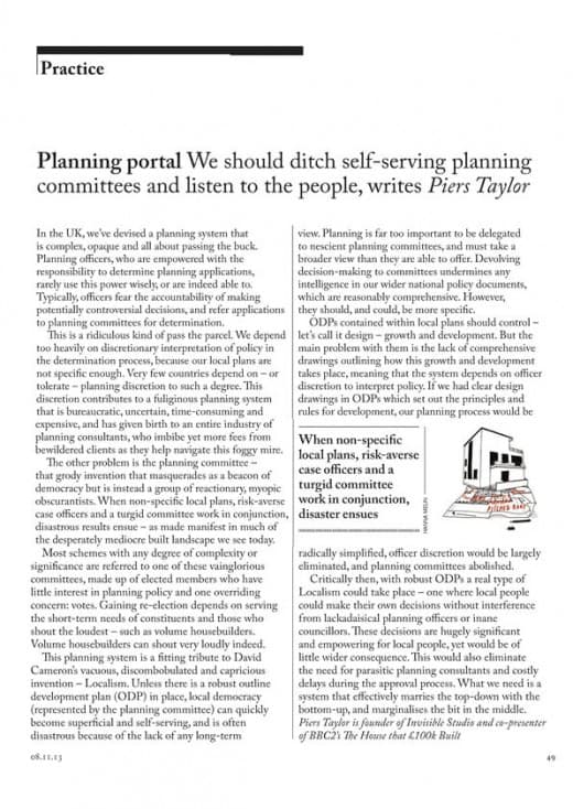
In The UK, we’ve devised a planning system that is over-complex, overly opaque and is all about passing the buck. Planning Officers, who are empowered with the responsibility to determine planning applications in a delegated fashion rarely use this power wisely, or indeed, are able to. Typically, officers fear the accountability of making potentially controversial decisions and refer applications to planning committees for determination.

This is a ridiculous kind of pass the parcel. We depend too heavily on discretionary interpretation of policy in the determination process, because our local plans are not specific enough. Very few other countries depend on – or tolerate – planning discretion to such a degree.

The significance of this discretion and the power it carries is immense and also part of the problem with our current system. It contributes to a fuliginous planning system that is overly bureaucratic, uncertain, time consuming and expensive and has given birth to yet another group of hangers on: planning consultants, who imbibe yet more fees from bewildered clients as they help navigate this foggy mire.

The other problem is the Planning Committee  – that grody invention that masquerades as a beacon of democracy but is instead a group of reactionary myopic obscurantists. When non specific local plans, risk averse case officers and a turgid committee work in conjunction, disastrous results ensue – as made manifest in much of the desperately mediocre built landscape we see today.

Most schemes with any degree of complexity or significance are referred by a case officer to one of these vainglorious committees, made up of elected members who have little interest in planning policy and one overriding concern – votes. Winning votes at a local level and gaining reelection depends on serving the short term needs of constituents and those that can shout the loudest – such as volume housebuilders. Volume housebuilders can shout very loudly indeed.

This planning system is a fitting tribute to David Cameron’s vacuous, discombobulated and capricious invention – Localism. Unless there is a robust adopted Outline Development Plan in place, local democracy (represented by the planning committee) can quickly become superficial and self-serving, and is often disastrous because of the lack of any wider or longer term view.

Planning is far too important to be delegated to nescient planning committees, and must have a broader view than they are able to offer. Devolving decision making to committees undermines any intelligence in our wider national policy documents, which are reasonably comprehensive. However, they should, and could be more specific.

Outline Development Plans contained within Local Plans should control – let’s call it design – growth and development. The main problem with Local Plans and ODPs is the lack of comprehensive drawings, which set out in outline terms how this growth and development takes place, meaning that the system depends on officer discretion to interpret policy, leading to the convoluted system that we have. If we had clear and categorical design drawings in ODPs which set out the principles and rules for development our planning process would be radically simplified, officer discretion would be largely eliminated, and planning committees abolished.

Critically then, with robust ODPs, a real type of localism could take place – one where local people could make their own decisions without interference from lackadaisical planning officers or inane councillors. These decisions are hugely significant and empowering for people, yet would be of little wider consequence. This system would also eliminate the need for parasitic planning consultants and costly delays during the approval process.

Planning cannot happen without a wide and long term view. What we need is a system that effectively marries the top down with the bottom up and marginilises the bit in the middle. More specific ODPs, less officer discretion and more individual freedom is the answer.
Categories Articles Tags

What next Zaha? Where now?

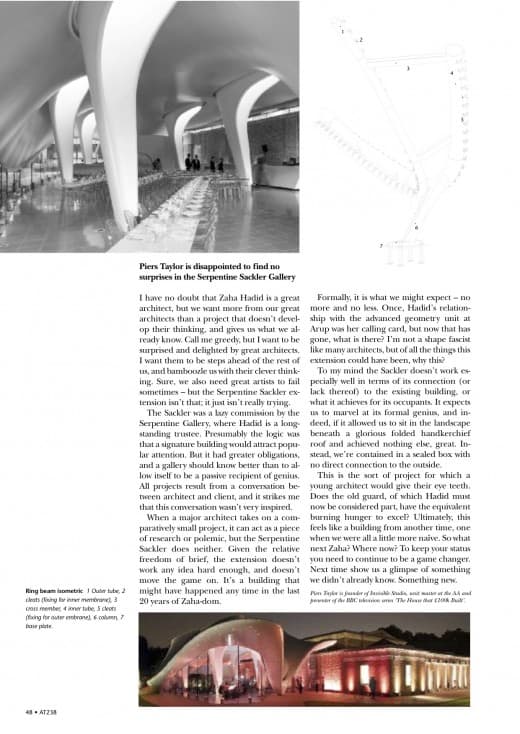
I’ve no doubt Zaha is a great architect, but we want more from our great architects than another cursory project that doesn’t develop their thinking in any way, and gives us what we already know.

Call me greedy, but I want to be surprised and delighted by great architects. I want them to always be several steps ahead of the rest of us, and bamboozle us with their clever thinking. Sure, we also need great artists to fail too – but the Sackler extension isn’t really failing; it just isn’t really trying.

The Sackler feels lazy in so many ways. It was a lazy commission by the Sackler, where Zaha is a trustee. The Sackler’s logic was presumably her commission would encourage lay visitors, rather than anything else. But they had greater obligations than just this, and a gallery should know better than to allow itself to be a passive recipient of genius. Any project – any interesting project – is the product of a conversation between architect and client, and it strikes me that this conversation wasn’t very inspired. Maybe Zaha isn’t used to being challenged – but being challenged is surely part of the delight of the best interactions with clients?

The point, of course, of a small project for a major architect is to act as a piece of research where either something – anything – is explored, or where it acts as a piece of polemic – but this is neither. With a small project from an enthusiastic client, you are so free from the conventional constraints – space, money, restrictions on experimentation – whatever – and given the relative freedom of brief from the Sackler in terms of what it had to do, the extension doesn’t work any idea hard enough. It’s not particularly clever.

Zaha’s oft praised greatness is more reason for not making allowances. One definition of a great artist (and part of the responsibility they have to retain this status) is someone who keeps pushing at the boundaries of what is possible and moving the game on. But the Sackler doesn’t move the game on. It’s a building that might have happened any time in the last 20 years of Zaha-dom. Formally, it is what we might expect – no more or no less. It is an instant Zaha by numbers. Once, Zaha’s relationship to the advanced geometry unit at Arup was her calling card, but now that has gone, what is there? I’m not a shape fascist, like many architects, but of all the things this extension could have been, why this?

The Sackler doesn’t even really work very well in terms of the lack of connection to the existing gallery (its main raison d’etre), or what it achieves for the occupants. It expects us to marvel at its formal genius, and indeed, if it allowed us to sit in landscape under a glorious folded handkerchief roof and achieved nothing else – great – but instead, we’re forced to be contained in a rather oppressive and mean sealed little box with a clunky soffit and no connection to the outside. Despite what Zaha may think, walls of glass are very much a physical barrier.

Materially I feel a little cheated, too – because it doesn’t really have materials – or at least doesn’t use materials interestingly. Materials were never really Zaha’s thing, granted, but here, the materials are little more than an inconvenience to her – particularly when they don’t go round corners very well.

The Sackler extension is the sort of project that a younger architect would have given their eye teeth for, used to demonstrate clever thinking, and show the world what they were capable of. It makes me wonder whether the old guard, of which Zaha is now part – have the equivalent burning hunger to excel.

Ultimately, it feels like a building from another time, one when we were all a little more naïve. But that was then – and this is now. What next Zaha? Where now? To keep your status you need to continue to be a game changer. Next time, Zaha, show us a glimpse of something we didn’t already know. Something new.


This review of Zaha Hadid Architect’s Sackler Gallery extension, for Architecture Today, by Piers Taylor, appears in the October issue of Architecture Today.

Categories Articles Tags

Architecture, Cycling and Transgression

It’s struck me recently just how alike architecture and cycling are, in the manner that they are practised. They each have a categorical method of practice that is absolutely clear – but only to those that are familiar with their unspoken, unwritten code of conducts (and I don’t mean all that RIBA guff). Step millimetrically across the invisible line on to the other side, and howls of derision will meet you. It takes a while to become accustomed – but once you’re there, oh, the delicious security of the conventions of a small group.

I remember when I started cycling years ago, I thought I’d mastered the art of belonging. Custom fillet brazed steel frame? Check. Period Italian gruppo? Check. Valves aligned with tyre logos? Check.

Oh, how we loved being so right. Oh, the smugness of those (us!) in the know. Oh, the derision when someone transgressed our mean little codes. Gosh, how we sniggered when someone turned up on a bike that they – wait for it – had bought from a shop. A SHOP! Not just a massed produced bike, but one with Japanese gears, and a frame made from plastic somewhere in the Far East! (Well, he called it carbon fibre, but we all sneered that it was plastic, and didn’t he know that bikes were supposed to be made from metal?).

I remember too when someone turned up with a saddle bag, someone else with a pump attached to their frame, and someone, once, with a mountain bike visor attached to their helmet.  My God, how we laughed.  Even though many of us have become a little more accommodating over the years – or if not accommodating, maybe a little more understanding – we still size up every other cyclist from several hundred yards away, and work out whether to acknowledge them with our knowing little half nod.

And you know what? Architecture is just like this. Gosh, how we all embraced those codes and conventions in every aspect of our lives when we were students. I remember when one of our Tutors turned up in a Japanese car – a fucking Daihatsu Charade! We never, ever, took him seriously again. How stupid could he be? How unknowing? Wasn’t this in part what architectural education was? Teaching us how to belong – and if a tutor couldn’t teach us this, what on earth else was there? Everyone knew there were only a few cars you could have. An early DS19 (with the right lights, and preferably the right bike on the roof) was the one to have if you could afford it. An old Mercedes W123 if you couldn’t. And a Peugeot 404 if you couldn’t afford that. Or, last stop, a 504. Almost nothing else, even if you didn’t give a shit about cars. But you couldn’t not give a shit, because, well, you were an architect, no?

Back to buildings though. I’m so pleased I’ve been reminded us that there’s property, and there’s architecture, and fuck me, they must never, ever, meet.  I’m so glad he reminded us, because I slipped up. I’d imagined that maybe this thing we called architecture could be opened up a little bit, in much the same way that the transgressions I’ve been making recently as a cyclist have been making me a little happier. You know what? I went for a ride recently with someone who had a mass produced, shop bought bike, and guess what? I wasn’t tainted by his gaucheness. Au contraire, I had a great time, and discovered that even someone who transgressed our codes could be a human being.

I’ve made a few similar transgressions in architecture, recently, and bloody hell, it’s fun. I’d almost go as far as saying it is life affirming. Usually, we can only make these transgressions if we can somehow aestheticise them – think the poverty-porn images of Rural Studio’s inhabited buildings (yup, I love ‘em too) which show us that it’s fine to open up architecture, as long we can get a cool image.

But generally, if we open our door a chink and attempt to have a wider conversation about whether or not architecture can go beyond the pages of the journals, if we dare to speak of it in terms that people (yes, people!) can understand – ooh, the howls of protest! That’s the wrong type of transgression. That’s the type of transgression that our once great profession needs protecting from. And maybe that’s right. Maybe we need to keep it as a little group of self-serving practitioners, speaking in code, acknowledging each other with our knowing little half nod, preaching to the converted. Maybe. I’m not convinced. But I’m going to try and find out.


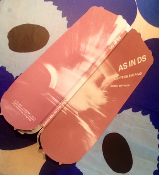
P.S. Alison Smithson? Yup she got it. Wrong lights though.

Categories Articles Tags

Right Back At You, Rory.

Rory Olcayto makes a good point in the AJ (25 Sept) about the state of the profession. Much of what many of us ever get to do is ‘fiddle round the edges’ and limit damage, hoping we can smuggle some architecture in when no one’s looking. Most of what I’ve done for 20 years or so is fiddling around the edges, because that’s the bread and butter of small practice – you take what comes and try to make the most of it. I suspect the AJ is pretty immune from what the reality of small practice is for many of us who need to earn a living from what we do.

There’s a curious snobbery in the profession, though, that we’re supposed to be having a certain type of conversation, with a certain type of people. People that get ‘architecture’. I’ve been part of this conversation, and there’s not much there. I’ve sniggered too, at those poor ordinary people, those poor people who don’t speak our language. I’ve sniggered too at Grand Designs and all those makeover shows in the past, worried that it’s dumbing down this great profession of ours. I’ve been horrified too at the commodification of our profession, where our divine wisdom can be bought and sold or, worse, bestowed on ordinary people. I’ve run appalled and tainted back to the comfort of my ivory tower. It’s a pretty scary world out there Rory, and I’m with you, up to a point. Much better to put our blinkers on and pretend that we’re doing something significant or worthwhile because, well, it’s architecture, innit?

But more recently, in the desire to escape from this rarified world, and bored of all the conversations I was having, I’ve been wondering if there was a different type of conversation to be had. One that moved away form the hallowed pages of the journals or the vainglorious academic institutions, into (whisper it) the mainstream. I’ve started a conversation that attempted to engage these ordinary, non design literate people. I was interested to know if I was able to have a conversation that could be had on their terms, not mine. This is the conversation we’ve been having in £100k house, and by god, I can tell you, it’s a shed load more interesting that most of the conversations that I’m supposed to be having.

I’ve seen first hand how making the most modest change to a poor piece of design can transform a building for the owners. I’ve seen the cynical shit that most of this country are fed by their draftspeople, and I’ve seen first hand the extraordinary transformation in the quality of these people’s lives that can be made by a few small changes. I’ve seen how people can become empowered through taking control over their environment and making their house moderately better. Yup, I’ve had to swallow my pride, but many of us forget that architecture is something that the significant majority of this country are allowed no access to. The only thing that stops them from exposure to architecture is us. If I can possibly help change that in any way – well, that feels pretty good.

Categories 100k house, Articles Tags

It’s Not About the Building…

Above – Yup, that works for me.

Without wanting to architects a disservice, we’re rather too fixated on the building. I’m realising, though, that in the important issues we face today – the development of our towns and cities – buildings are far less important than the spaces between. It sounds obvious when you say it, of course, but it’s still a point that many people seem not to realise.

In the criticism of the ubiquitous British developer housing, most people focus on how bad the buildings are. I’m not disputing for a minute that the buildings are anything other than appalling, cynical and lazy, but the main issue is one of site layout.

What I mean by this is that if you took the terrible architecture of the average British estate and rearranged it intelligently into a format where buildings formed street frontages, where the wasted space was removed, where the driveways were removed, where the spaces between buildings where reduced, where street widths were reduced, where blocks were formed with definition and hierarchy and corners contained shops and pubs, and there was a finer grain of pedestrian access across the area – you’d pretty much have the perfect place.

You could still have the terrible trappings of lazy developerdom – the pvc windows, the nasty brick and the horrible interlocking roof tiles – and it would be fine. All this, of course used to be second nature to us – as it’s pretty much the fabric of most towns across the UK, but it’s now a formula that alludes most house builders and developers. Are they just too stupid, too greedy, to lazy or just too conservative to think differently?

Categories Articles