Indeterminate Space
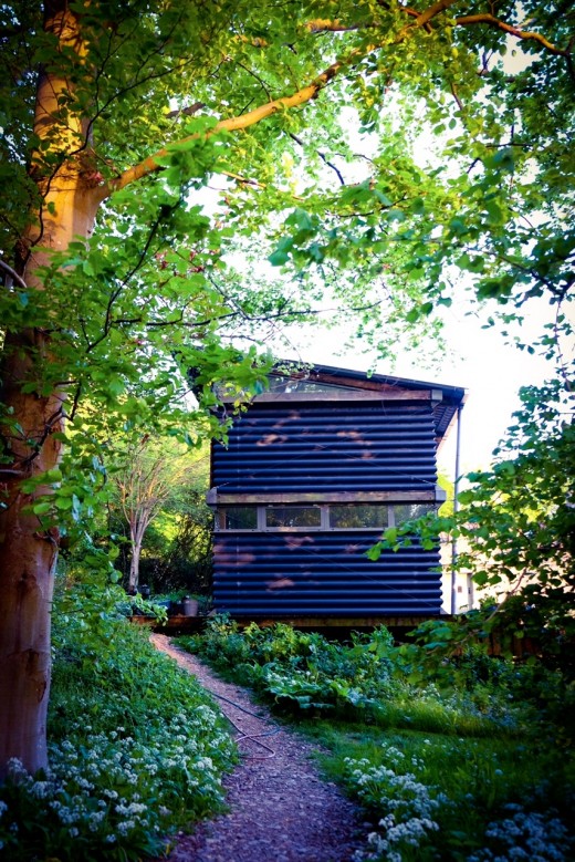
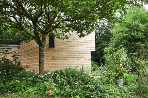
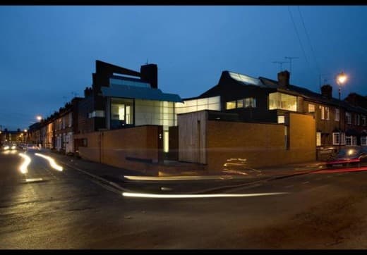 Recently, I went to film the Marsh House in Nottingham by Marsh:Grochowski for the next series of ‘The House That £100k Built. The house completely bowled me over – more so than almost any other house I’ve seen. I’d known the house through photographs in journals, but seeing it in the flesh made me realize what a truly remarkable building it is. In almost everything the house does, there is an extraordinarily lesson for domestic architecture.
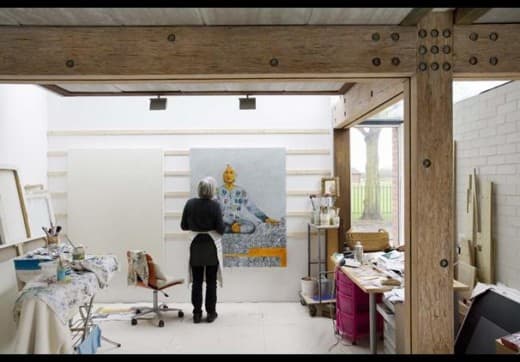
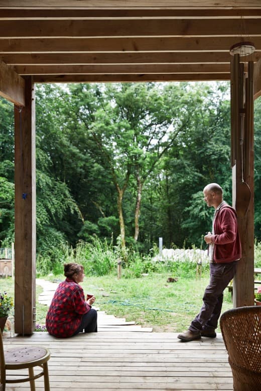
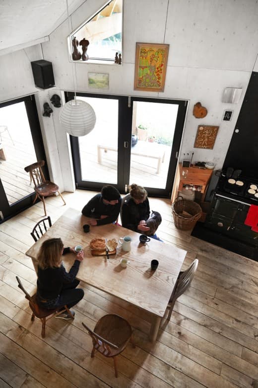
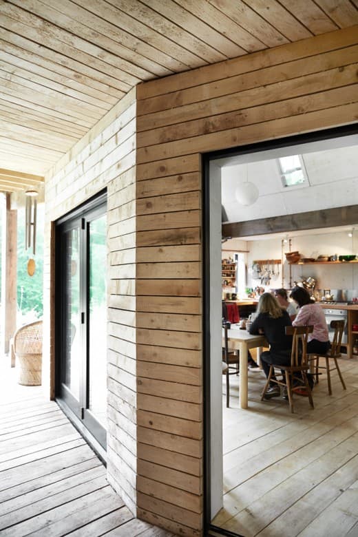
The house is is Julian Marsh’s own, and where he lives with his partner artist Jude Liebert, and Jude’s brief to Julian was ‘let’s just have a little flat, with loads of space underneath to make stuff’. Julian calls this space ‘indeterminate space’, and I think it is just about the most important space houses can have. It made me realise just how strangled we are by these terrible little room designations we are so quick to give our houses – the kitchen, the living room, and so on. What we all really need is indeterminate space, which we can use for anything we choose, and occupy differently as needs change, and seasons change. Really good spaces are defined by light, structure, scale, materials and views – not labels purporting to describe (and, usually, limit) function.
The big organizational strategy for the house is to group the living spaces around a south facing growing courtyard with a south facing unheated internal wintergarden cooling the internal spaces in summer and heating them in winter. The wintergarden is a pretty radical thing, as it contains all the circulation space and stairs, meaning that Julian and his partner have to go into an unheated space to get from their bedroom to their kitchen even in the depths of winter.
Having a brilliantly well considered environmental strategy means that the space will never drop below 12 degrees, even in the middle of a harsh winter, but it’s still a pretty radical proposal for living that flies in the face of the culture of sealing up buildings, where having one uniform and stable internal environment is now the norm. As well as every other strategy, the environmental strategy of the house challenges pretty much every building fundamental, and offers hope for those of us who feel strangled in red tape.
Natural ventilation featuers large in Julian’s house. There are clear and defined ventilation paths through the building, with windows, flaps and vent panels that need to be adjusted and operated – a little like sailing a yacht. Julian’s principle of using natural ventilation comes as a big relief for me, in an age where the culture of airtightness is becoming the norm. It is also a relief to see someone challenge basic assumptions, and find a method of using building regulations to support, rather than strangle, his vision.
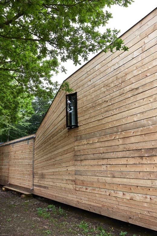
One of the other fascinating things in Julian’s house is how he has used his environmental strategy to define much of the architecture, from the big picture of what the building looks like, how it is laid out, right the way through to the detail. The environmental strategy is visible in the overall form of the building (with it’s greenhouses on the roof, drawing air up through the house), but it is the detail, in particular, that is a real joy. In the wintergarden there is a sublime double height wall which acts as a heat sink – the wall is designed as a series of precast lintel ‘shelves’ with thousands of clear plastic bottles filled with water stacked on them. This is beautiful and decorative, but also highly functional. Water is thermally dense, and consequently all the bottles contribute to the thermal mass of the wall. Simple, low tech, cheap, and beautiful.
It is this kind of resourcefulness that makes the house sing. Freed from the tyranny of having conventional ‘bedrooms’ with his idea of indeterminate space Julian and his partner have a simple thick curtain they pull around the bed at night to keep the light out – and there’s masses of light, as Julian has a penchant for what he calls the ‘sneaked view’ – windows that are sneaked in where you least expect them in order to open up an unexpected view. The sneaked view is such a playful and fun idea, and this spirit of playfulness is everywhere in the house.
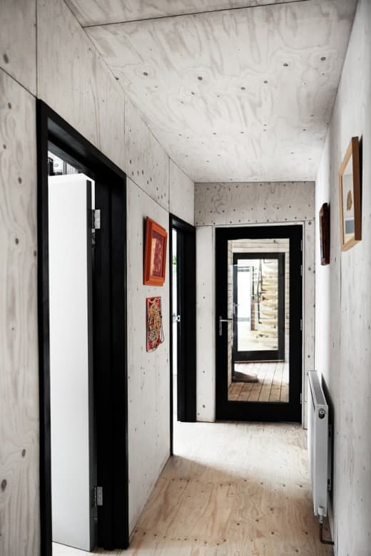
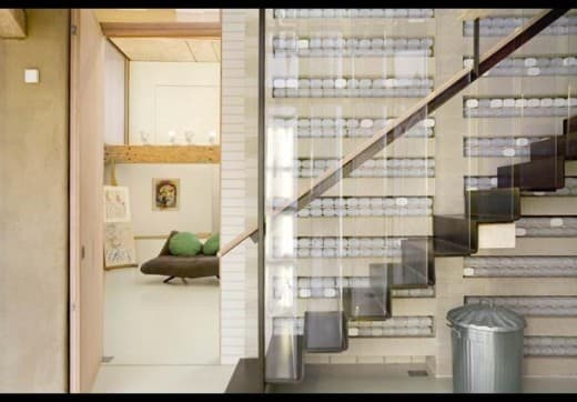 Julian knows the important of the materials that you touch, and consequently has invested time in door reveals, thresholds and simple posts for hand rails that are bound with the most perfect piece of coloured rope at exactly the point your hand falls. This means the remainder of the materials can be functional in the best sense of the word – all the thermally massive precast concrete soffits are exposed, as are the recycled timber ‘Parallam’ beams, and the plastic meat packing curtain balustrades.
The whole house made me wonder why on earth so many of us start with such a misguided idea about ‘rooms’ when we start to design – rather than wrapping an extraordinary series of spaces around an idea of how we might live. There’s a terrible and mean tyranny in estate agent speak that is used to describe houses, and if any of us aspire to beautiful and appropriate spaces that support rather than throttle the way we live, we must go beyond narrow presumptions around domestic space.
We also need to go beyond Building Regulations. So often I hear the excuse ‘Oh, Building Regulations won’t let me’ as an excuse not to try something interesting, but as Julian has shown, there is usually a way round regulations, which are there more for guidance than anything else, and are certainly not design tools. It is this spirit of navigating around obstacles and problems that leads, as Julian has shown, to interesting solutions, and it is this spirit that I encourage self-builders to embrace. Dream up the spaces you most want to live in, and then find a way to use regulations to support, not throttle your vision.
© Piers Taylor, 2015
